--------------------------------------------------------------------------------------------------------------------
Game: Disney's Cars Interactive Coloring Book
Manufacturer: Techno Source
Release Date: 2009
Genre: Activity
I am not a Disney's Cars fan. And I'm gathering most other people aren't either. I mean, it's ok... And that's it.
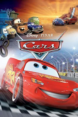
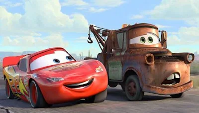
When I first saw Cars in theaters back in 2006, it was one of the few movies I watched in the theater that quite nearly put me to sleep. The story about a champion who takes a wrong turn, ends up far away from the glitz and glamor of his old life, and has to be put in his place and learn humility to save a small town's livelihood is about as cliched and predictable a plot as you can get. Just above "let's put on a show to save the orphanage/community center/school/strip mall" and "misunderstood genius is constantly put down, but his ideas save the day in the end and show others the error of their ways."
Both of which were also the plots of other very mediocre high-profile CGI movies.
But ok, there's only like a dozen plots that are continually recycled over and over again in storytelling. It's the spin they put on it that's the important part. Heck, the Disney Jungle Book remake was the latter plot, and that might have been better than the original. ...But they really DON'T add anything to this story. We still have the hot head who needs to learn the value of teamwork and respecting his elders, the love interest who's totally not interested in the lead until she spontaneously is, the retired role model who was on top of the world until he was humiliated, the quirky goofy sidekick character who embodies all the personality in the movie, and the financially bereft town that's about to go under unless they can get the lead character to promote their businesses. Literally every scene, every character, every LINE is predictable! The only thing they change is that the characters are living cars! ...Which actually might be interesting if they showed us how a world of cars would operate. ...They don't.
I will give them credit that, being Disney/Pixar, it's a very nice-looking movie. The colors are beautiful, the animation is top notch, the characters stand out, and even some of the humor is pretty funny, especially coming from Larry the Cable Guy's delivery. ...But it's also a very EMPTY movie. Most of the shots are of desert landscapes or deserted roads, with occasional shots of a worn down town. Like I said, this could have been an opportunity to show how a world populated by cars would operate(how they pick things up, how they work things like phones, how they come to be in the first place, if there's any organic life on this planet, etc.) Instead, they just give us a landscape you could insert into ANY movie and it would fit.
You could argue that the more recent The Good Dinosaur also had the problem of a lack of style and instead just showing us empty plains and mountains. ...But while they added to the themes of loneliness and unfamiliar situations the movie focused on, Cars doesn't have that excuse. It's just bland landscapes and predictable plot lines, which, for a Disney/Pixar movie, is one of the biggest sins they can commit.
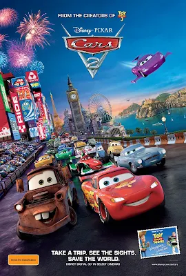
I'll talk about the sequel with the next Cars game I feature, so I'll just end here by saying that Cars isn't one of Disney/Pixar's best. It's far from being one of the worst or most boring movies I've ever seen, but for a movie from two animation giants, it's a letdown.
But... I get why this franchise exists. It's what's known as a "feature-length toy commercial", in the same vein as Transformers, GI Joe, My Little Pony, Bratz, etc. They're movies and shows that aren't supposed to stand out or even necessarily be good. They're just there to introduce people to their world and keep them interested long enough to buy some merchandise. So basically, it's a theatrical Hot Wheels movie Disney decided to make without involving Hot Wheels.
And boy howdy, Disney has milked this franchise for all it's worth. Not only do we have the movie and its sequels, but 2 spinoff movies, 2 microseries, several video games either standalone or as part of another game, an entire section of Disney's California Adventure called "Cars Land", and COUNTLESS little die-cast cars that have earned Disney $10 billion worldwide(which has probably doubled since that article was published.)
Now you could argue that all because it's a merchandising push, that doesn't excuse the fact they're substandard movies. Things like the original Transformers The Movie and the current My Little Pony: Friendship is Magic have proven that even shows produced solely to sell toys can be made with the same professionalism and care that other classic movies have shown. Heck, Toy Story could be seen as one of those films, and the trilogy has gone down in history as some of the greatest movies of all time! ...But honestly, my only argument is that they are completely in their right to make money, and while the franchise isn't the greatest, it's harmless and does lend itself to expansion and exploitation.
Especially by knockoff film studios. ...But that's another story.
So today, let's talk about one of the hundreds(if not thousands) of things to bear the Cars name(and 1 of 2 Plug n Play games they've produced based on it): the Disney's Cars Interactive Coloring Book.
And look. We're finally featuring a game that includes its original packaging! Brand new, still sealed in packaging even! ...Well, we'll soon put an end to that.
According to the packaging, this isn't just merchandise based on the first Cars movie, but it's a proud part of "The World of Cars" franchise.
Which, seeing how this was made in 2009, when the movie had already been out for 3 years and the Mater's Tall Tales series had just begun airing, it probably needed that distinction to avoid being seen as a leftover tie-in.
But in case you missed that it's a coloring book, right underneath, it proudly proclaims "Pictures to Color!"
While on the sides, we're told we can "Connect the Dots and Color!" and "Color by Number!" Please, tell me more. Can we indeed color in this game?!
Apparently, we can, because it also tells us about its "30 Coloring Activities!" Great! I can probably go get a Cars activity book with 30+ pages for a buck, but this is letting me know I can have that for $20-$30!
Right next to an old, portable, mono TV, they also tell us to "PLUG IN FOR TV PLAY!" ...In all capitalized letters inconsistent with the rest of the text on the packaging... And they point that out like it's an optional feature. I mean, I guess you COULD play this without a TV. ...You'd have to have the memory of Dustin Hoffman from Rain Man to know where everything was, and you wouldn't be getting the artistic satisfaction of viewing your own creation, but I guess it's possible...
On the back, they again reiterate that there are "Three Fun Ways to Color!", such as "Pictures to Color", "Connect the Dots", and "Color by Number", as well as step-by-step instructions for each! ...Well, thank you. I don't think I'd ever be able to grasp such advanced artistic terms as "Choose a Picture, Pick Your Colors, Create Your Own Work of Art!" without your help.
And if the system really has a color gradient feature, I'll be very surprised...
"Product specifications and colors may vary." ...So I'm not guaranteed what's clearly shown in the transparent package? Good to know. ...Or maybe they mean that when I open it up, there's a 1-in-3 chance it'll be full of Skittles? Well, I guess I win either way.
"Recycle this package." Not a chance. I'm a collector, so I'm just going to stuff the system back in after I'm done with it. This thing will be with me until the end of time. ...Seriously, when I die, I'm going to order that my entire collection of Plug n Play games be buried with me. ...It will be a rather large casket, sure, but at least I'll be next to the things I love the most forever!
And before I stop stalling and actually open the thing, it's very important to know that you have to be 3 or older to use this. ...No, there's no "0-3" symbol on this, and even if there was, it already says "3+", so I can't make my age purgatory joke to make up for the last few brick sets lacking one. Stupid game system ruining the most fun I'll have with it...
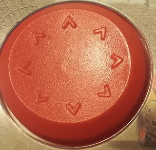
And here's the console itself. A pretty generic-looking red controller with a promotional art Cars sticker pasted on the face and red, green, and blue buttons. ...Yeah, this was totally worth the buildup.
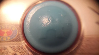
Though I do like the Mickey Mouse glove on the green button
And Cinderella's castle on the blue. ...What these have to do with Cars, I don't know, but it's a nice feature.
And in case you forgot this was Disney, they remind you in big letters on the battery cover. ...Though since 1 in 2 Plug n Play battery covers are lost, I don't think that's enough to provide brand recognition...
With the battery cover off, we can finally see that the system takes... Four "AAA" batteries... ...Gee, who does that remind you of?
That's right. This is another offering from Techno Source.
The people who brought us Elmo's World, so far the WORST Plug n Play game I've featured on this blog... I've already gone over them in that post, so I'll skip another history lesson until we feature something more relevant.
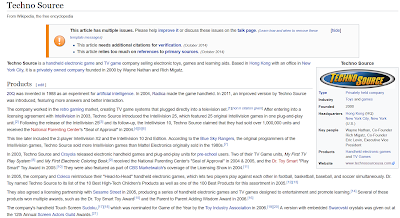
Though I will say that their Wikipedia page is in desperate need of an update. A bunch of the facts detail events in 2006, and I wouldn't be surprised if that was the year of the last major update.
At the very least, they could update the broken link to their website.
Starting the console up, we see that they didn't even bother including the Cars name on the title, and it just goes under the Disney Interactive Coloring Book title, with a dark checkered flag in the background and some random car sounds the only things to give the impression this is a Cars game.
I assume this was a cost-saving measure so they could just slap the title on other games with minimal editing. There are at least two other "Interactive Coloring Books": a Toy Story version and a Disney Princess version. I don't own either of those(yet), and the only video footage I could find of one of them was especially grainy, but since I did see the exact same title used in that game, it appears that's the case.
As it repeatedly bragged on the packaging, the console is split into 3 different areas, each with 10 of the 30 pictures it also boasts:
Connect the Dots
Pictures to Color
Color by Number
Connect the Dots is a sub-basic version of its namesake. ...What do I mean by that?
I mean that most of the elements of a Connect the Dots puzzle are absent. Numbers that lay out which order to connect the dots, dots that are laid out in such a way to curve lines, and details inside the dots that add to the finished picture for instance. Instead, we're simply shown to guide the cursor from one dot(lightning bolt?) to the next. And seeing as how the main points of connect the dot puzzles are to teach kids how to count and to help them recognize order and sequence, all you're left with is a repetitive button masher that's more likely to bore your kids.
I say that, but these connect the dots sections are insultingly short. They're only around 10 dots each and they're all in a circular pattern. And since there are only a few dots they don't guide the cursor to form edges or curves, instead filling in the line details automatically as the connections are made. I literally feel insulted, that the game is saying "You're too stupid to draw like that, so we'll just do it for you." If they had just gone with the standard corners and straight lines like a normal dot-to-dot puzzle, THEN filled it in with the finished image, I would have gotten to view my accomplishment for a second, then feel like I've unlocked the full thing by completing the puzzle. Instead, I feel like a kid who's pretending to swing his dad's golf clubs, then the dad takes it away, swings the club, scores a hole-in-one, and tells him "That was you! You did that!" ...Just when you thought connect the dot puzzles weren't pandering enough...
I really hate to say it, but the shape matching puzzle in Elmo's World was better than this! At least you could learn association, and the finished puzzle looked like what a bundle of shapes would look like, before celebrating your accomplishment with a moving picture!
If Calvin was upset with how a regular connect the dots puzzle required sequence, he'd have an absolute fit over this game.
Even more so than when he decided connecting the dots in order was underwhelming...
After connecting the dots, they fill in the rest of the picture(again making the stupidly repetitive connect the dots section pointless) and allow you to color (or rather, flood fill the picture within the lines...) ...And this is where I was colored* mildly surprised.
*No pun intended, but I'll take it anyway.
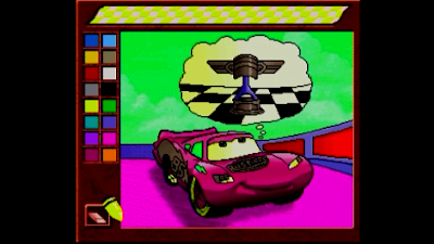
You know how I said I'd be surprised if the pictures on the back of the packaging looked anywhere as detailed as they were presented? ...Well, they do! When you add a color to a part of the picture, the texture associated with that area also appears behind it(clouds for the sky, tarmac for the ground, shading on parts of Lightning McQueen, etc.) It's actually a surprisingly nice effect to give a coloring section!
Made even better by the fact it's not color coded. So if you've ever wanted sailors to take warning, you can indeed color the sky red. ...At any time, not just the morning.
So in the end, you can get a pretty nice picture. ...Even if it's just holding your hand and adding the details automatically...
Unfortunately, it's not enough that the coloring sections are solely "flood fills" you'd expect with most cheap painting software, but they further limit how much area you can color in. Rather than each section surrounded by black outlines having its own fill area, when you select a color and hover the cursor over a section, a gray area shows what will be filled in. For example, both the sky and Lightning McQueen's side windows share a fill area, as well as the outside of the back wall, and both McQueen's tires and one of the checkerboard patterns. In total, that leaves EIGHT sections that can be colored differently for this picture! I remember playing activity center games in the mid-90s on CD-ROM that had coloring pages, and they allowed for much more of an area to flood fill...
Maybe it's overcompensation for the control scheme, which... isn't all that great to put it mildly. Instead of a control stick, they opted for this awkward directional pad, which doesn't feel like it gives you much control over the cursor. There's only 8 directions, but you can often find yourself pushing the wrong direction without knowing it and having to reorient yourself. Once again, another console that requires you to take your eyes off the screen to focus on the controls...
So after you've gotten bored with your masterpiece, since, needless to say, there's no way to save or print your creation unless you have a particularly high quality video capture device, you just hit the blue button to get booted back to the menu and choose another picture to quickly connect the dots so you can get to the coloring section.
Then, after you've finished all 10 pictures in the Connect the Dots section, you can then do the exact same thing with the 10 pictures in the Pictures to Color section.
This is exactly the same as the Connect the Dots section, only without the pointless dot-to-dot part at the beginning. The same flood fill-style pictures with the same color palette to choose from. And again, only 8 areas to fill in...
Oh, and the color palette bar on the side, for some reason, is inconsistent from picture to picture. When I was rushing through the rest of the pictures to fill them in, the first color I selected from the top left of the colors offered would vary from blueish to pinkish to grayish, etc. I think it also cycles through different shades of colors depending on the picture as well, adding different shades of blue, green, yellow, etc. and discarding other previous shades, but it was hard to tell comparing several pictures at once. I strongly hope that this was an effort to get kids to try different colors, because if it turns out that a color palette had to be programmed for each picture... Wow, guys...
Alright, I need to mention something else positive about this system. I guess I can say that the coloring pages really aren't that bad. The pictures are clear, the line work is skilled, and the attention to detail is commendable. They're all pages I would like to find in a regular Cars coloring book.
 |
| Ashens. Screwing up childhoods since 2006. |
I've seen much lazier artwork in things that really don't even deserve that high of artistic merit in the first place is what I'm saying.
And again, the gradients and texture effects they incorporated into the pictures when you paint them really make the pictures look masterful. ...Even if it's a fixed automatic effect that can't be turned on or off and can't be applied to different pictures...
Finally, we have the last 10 pages in the section Color by Number, which breaks from the tradition of the first two sections and tries something nicer to look at, but even more limited than the others.
As you can infer by the name, it's once again something you can find in a children's activity book, usually bundled with crayons or paint. Just match the colors with the associated numbers. 1 is gray, 2 is light blue, 3 is slightly lighter gray, and 473579257873 is Electric Ultramarine*.
*Which is totally what I'm calling my late-80s metal tribute band.
I'd say this was the most straightforward activity on this console, but since we already had their poor excuse for a connect the dots puzzle, this is honestly a step up. At least there's variety and an actual need to think and associate colors and numbers. It's not much variety or challenge, but I'll at least put it at the same level as the shapes minigame from Elmo's World.
One of the challenges is trying to find where the numbers even are on the page. There's 8-10 colors for each page with their respective numbers placed somewhere on said page, and it can get a little mucky when the numbers are placed on top of one another or where there's a large amount of black area. It doesn't take very long to eventually find all the numbers, thankfully, but long enough that when you find it, you're going "What were they thinking putting the 1 on top of that guy's grill?"
But when you do solve the puzzle, you're treated to a pretty nice rendition of some concept art, even nicer than what you get from properly coloring in the previous coloring pages. It legitimately looks like something you'd buy as a Disney Store exclusive. I don't know if this is actual concept art, just slightly compressed for the console, but it looks great. I wouldn't mind having something like this on my wall.
However, unlike the previous two sections, there's no coloring option. It just focuses on the picture until you go back to the main menu. I'd say this isn't exactly a great loss based on what we've seen previously, but it would have been nice if they made it consistent with the rest of the console.
And that's the Disney's Cars Interactive Coloring Book. ...Without the book. ...Or most of the coloring. ...And not very interactive either, come to think of it. But they got the first two words right, so 2/5. ...Which is still an "F"...
--------------------------------------------------------------------------------------------------------------------
Design: It's your standard rounded controller shape with a Cars sticker on it. It's much nicer looking and feeling than the Elmo's World design, with a much higher quality sticker that looks like it belongs on this console, but that shouldn't be the standard I hold these to. It's just a generic console with nice colors and a funny choice of icons for the buttons. Also, since most of the games I feature here won't include the packaging, I'm not going to comment on the packaging of those that do.
Controls: The buttons work fine and are big and spaced far apart enough that you're not going to get them mixed up, but the strange mix between a directional pad and thumbstick really makes moving awkward. You can easily end up pushing a direction that you don't want to push and cause the cursor to go off track. Still, since it's a casual coloring game, that doesn't affect the gameplay much. It's just annoying.
Music & Sound: There's no music, so automatic nil there. The sound effects are just your typical low-quality public domain car revs and screeches, cheering noises, and "bloink" sounds. They're not annoying, but they don't add anything either. They could have made this console without sound effects and we probably wouldn't even notice. Still, I guess it's better than stock nursery rhymes...
Graphics: The graphics are surprisingly high quality and the colors are varied and beautiful! The choices on the menu screen are clear and have a bit of animation, the icons in the game are distinct and you can track the cursor, and the coloring pages are top notch! I'm especially impressed with the pictures in the Color by Number section that truly look like professional concept art. Even playing this game on my UHD TV, the pixellation wasn't that terrible. You could probably hook it up to a video capture device, hook that up to a computer with a printer, and print out some relatively good quality coloring pages! ...Still, there wasn't anything that really "wowed" me. No phenomenal animations, no pseudo-3D models, no FMV, nothing that really pushed the system beyond its limits. But, for what it is, it's above average I guess.
Gameplay: ...Was there any? It's a substandard coloring book that only operates on flood fills in very limited areas. It comes with a Connect the Dots section that barely passes for dot-to-dot, and a Color by Number section that at least gives us some challenge and some form of reward. the most fun you're going to get out of this is just admiring the textures and gradient effects and seeing what they look like under each color. Besides that, there's not a whole lot going on. I can think of 20 or even 30-year-old games that could do more with their coloring applications than this can. And give a lot more variety in their customization of the pictures.
Replay Value: I guess if a little kid is bored, they can come back and see how many ways they can color a picture. Besides that, there's nothing to keep you coming back. ...Unless you're printing out the concept art.
Overall:
As with Elmo's World, it only meets the bare minimum of being considered a game. Or being a coloring program. The interactivity is limited and inconsistent, much of the extra stuff they put in is monotonous, and the coloring itself is barely coloring. I give it higher praise for its graphics, but that's not exactly something to keep coming back to. I'd only recommend this if you really want to see some pictures where you can basically add Photoshop filters without using Photoshop. Otherwise, just buy your kids a coloring book and some crayons. It'll last longer, won't take up the TV, and be much more educational and custom.


















No comments:
Post a Comment